FLEXIT
FLEXIT is responsive WordPress theme created for photographers, personal sites or portfolio based mainly on images. 8 different gallery types are here for you to create amazing photo walls, gallery pages and posts. Theme colors are fully customizable with over 40 color pickers same as typography. FLEXIT looks awesome on mobile devices. You can add some personality to all pages by changing default page background and add parallax effect. You can also use prepared templates with multiple functions and powerful options to create something awesome.
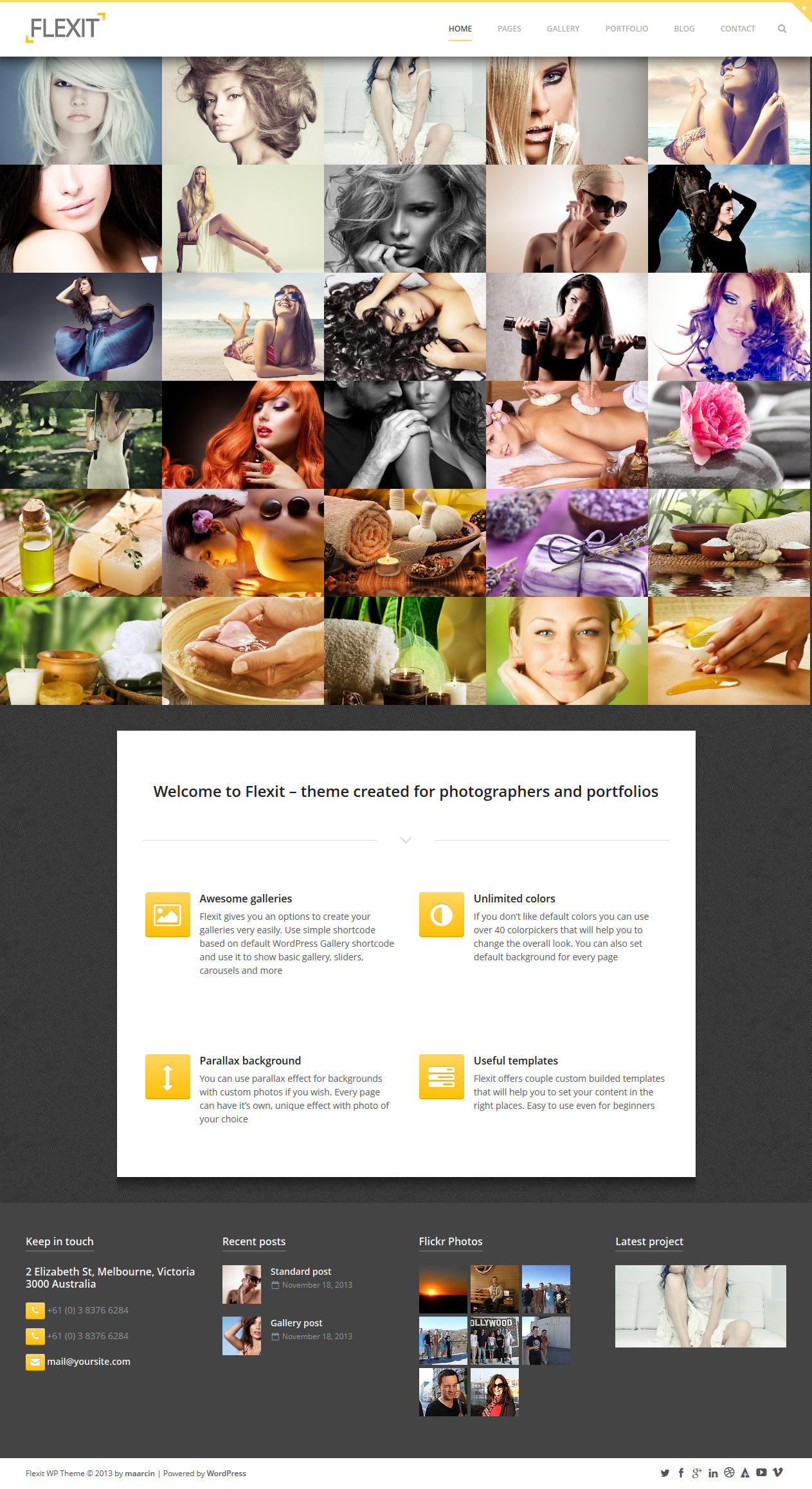
Theme Features:
- Responsive and super flexible layout
- Retina ready elements
- Created for photography, personal and portfolio pages
- 8 different gallery styles
- Unique image showcase where you can add points and use them to show additional description for Your image
- Awesome vertical shadow that you can enable or disable in Theme Options
- Unlimited colors with over 40 colorpickers
- Option to enable/disable search in header
- Custom page backgrounds – create your own eye-catching page backgrounds with custom images, parallax effect and more
- Parallax page backgrounds
- Slide out widgetized top section with 6 widget areas and advanced builder
- Useful and powerful shortcodes to use with shortcode generator
- 10 custom templates
- Support for comments in portfolio items and ‘Related projects’ feature for showing projects from the same category
- Translation ready – included mo/po files will help You to translate this theme to Your own language or use it with multilingual plugins like WPML
- Awesome and quick free support with external forum for all my Clients
- Advanced typography options
- All available Google Fonts with unlimited access to all features like font styles, weight, character sets etc.
- Standard layout with content aligned to the left, right or centered
- Gallery style layout with content aligned to the left, right or centered and with option to set width for each content section
- 2 blog layouts: masonry (grid) and standard layout aligned to the left, right or centered
- Mega footer – build your own footer layout. 1-6 columns and you can choose size for every column separately
- Over 50 preparedrepeatable backgrounds to use right away with easy way to add your own
- 3 custom widgets:
- 2 services types: left aligned and centered
- Over 350 font icons
- XML file with demo content included
[button-red url=”http://www.onwpthemes.com/go/flexit-demo/” target=”_blank” position=”left”] View Demo [/button-red][button-red url=”http://www.onwpthemes.com/go/flexit-download/” target=”_blank” position=”left”] Download Now [/button-red]
-
 JPhotolio
 is premium responsive wordpress themes for Wedding Photographer. This themes provide everything
JPhotolio
JPhotolio is premium responsive wordpress themes for Wedding Photographer. This themes provide everything -
 Jarvis
 is the perfect one page parallax WordPress theme for corporate, agency, nonprofit,
Jarvis
Jarvis is the perfect one page parallax WordPress theme for corporate, agency, nonprofit, -
 Grafik
Meet Grafik, it is a powerful Portfolio, Design & Architecture WordPress Theme for
Grafik
Meet Grafik, it is a powerful Portfolio, Design & Architecture WordPress Theme for
About Author
ThemeForest
At ThemeForest you can buy and sell site templates and themes to skin popular CMS products like WordPress, Drupal and Joomla. Files are priced from just five dollars, based on the complhexity, quality and use of the file.